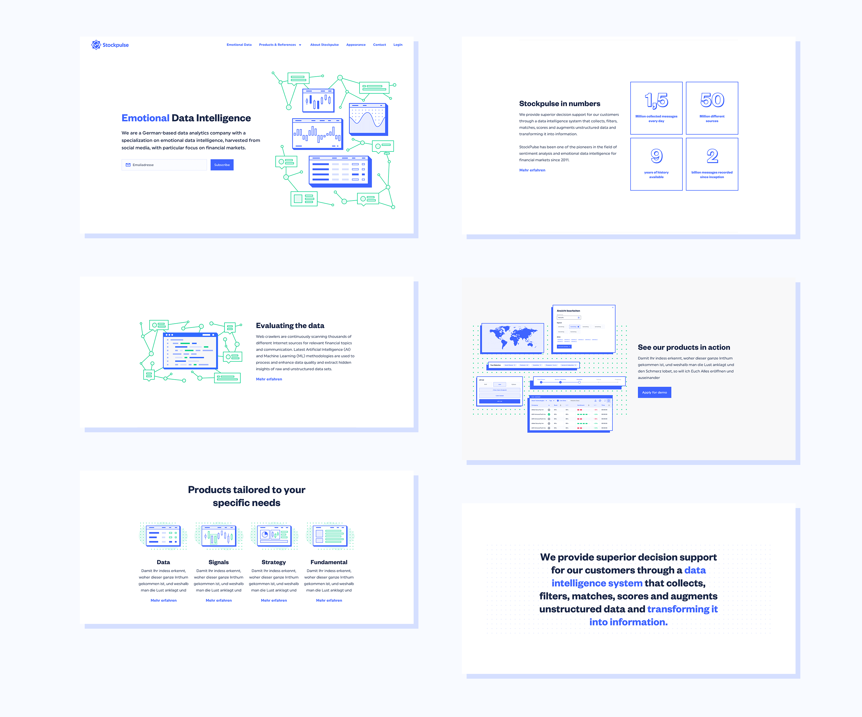
Emotional Data Intelligence
Stockpulse provides superior customer decision support through a data intelligence system that collects, filters, matches, scores, and augments unstructured data, transforming it into information. The task was to make sense of the given information architecture in both concept and design. Both architecture and the visual approach were set to maximize usability, making the hard topics more accessible.
CLIENT
Stockpulse GmbH
ROLE
UI Design | UX Design | Illustration | Branding | DesignOps
Understanding Stockpulse
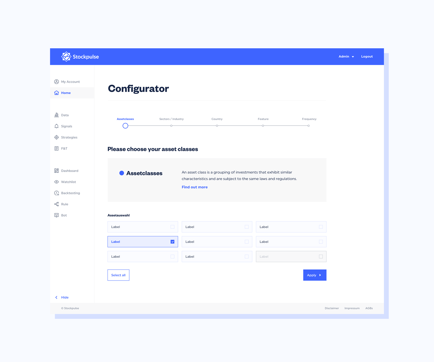
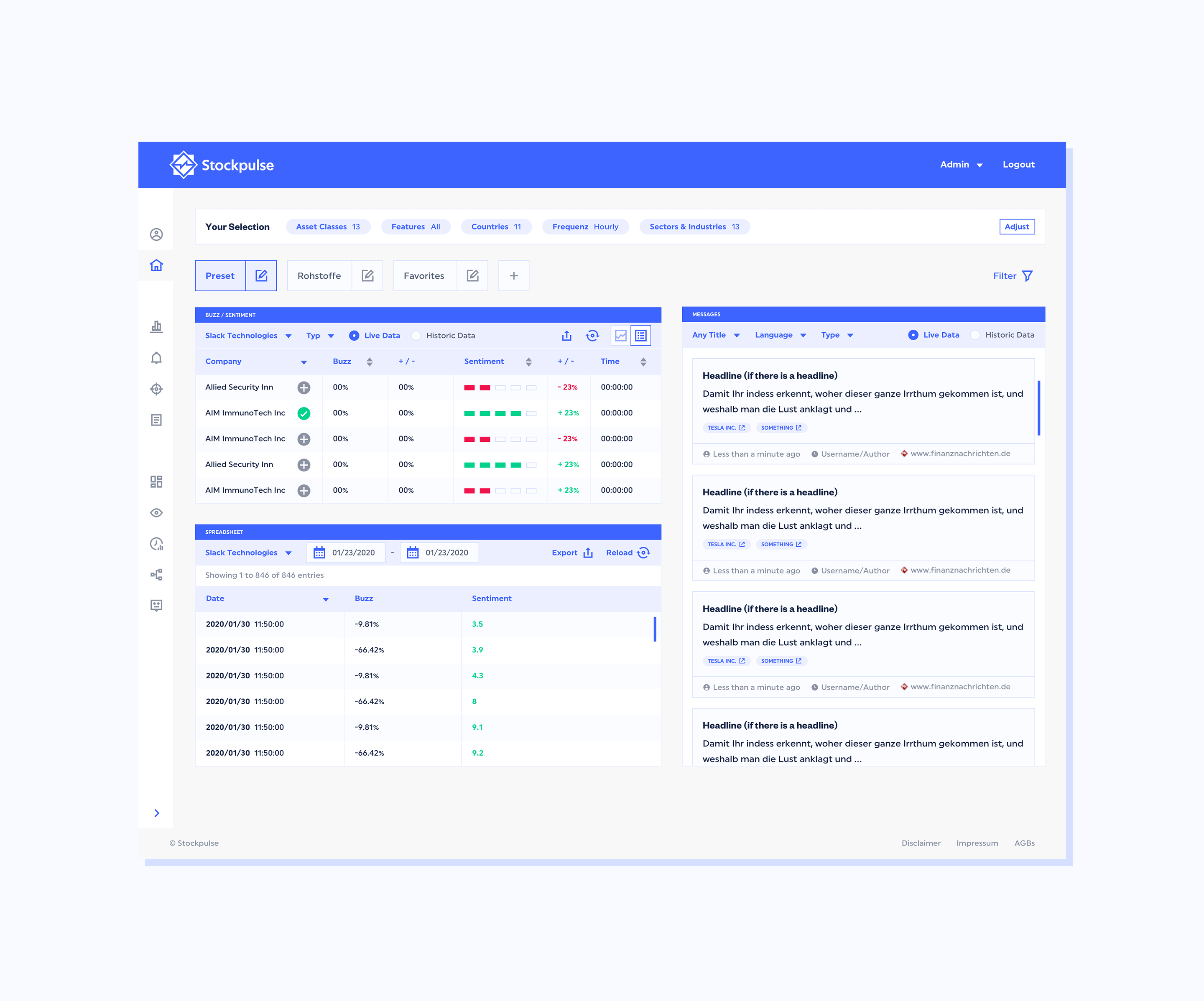
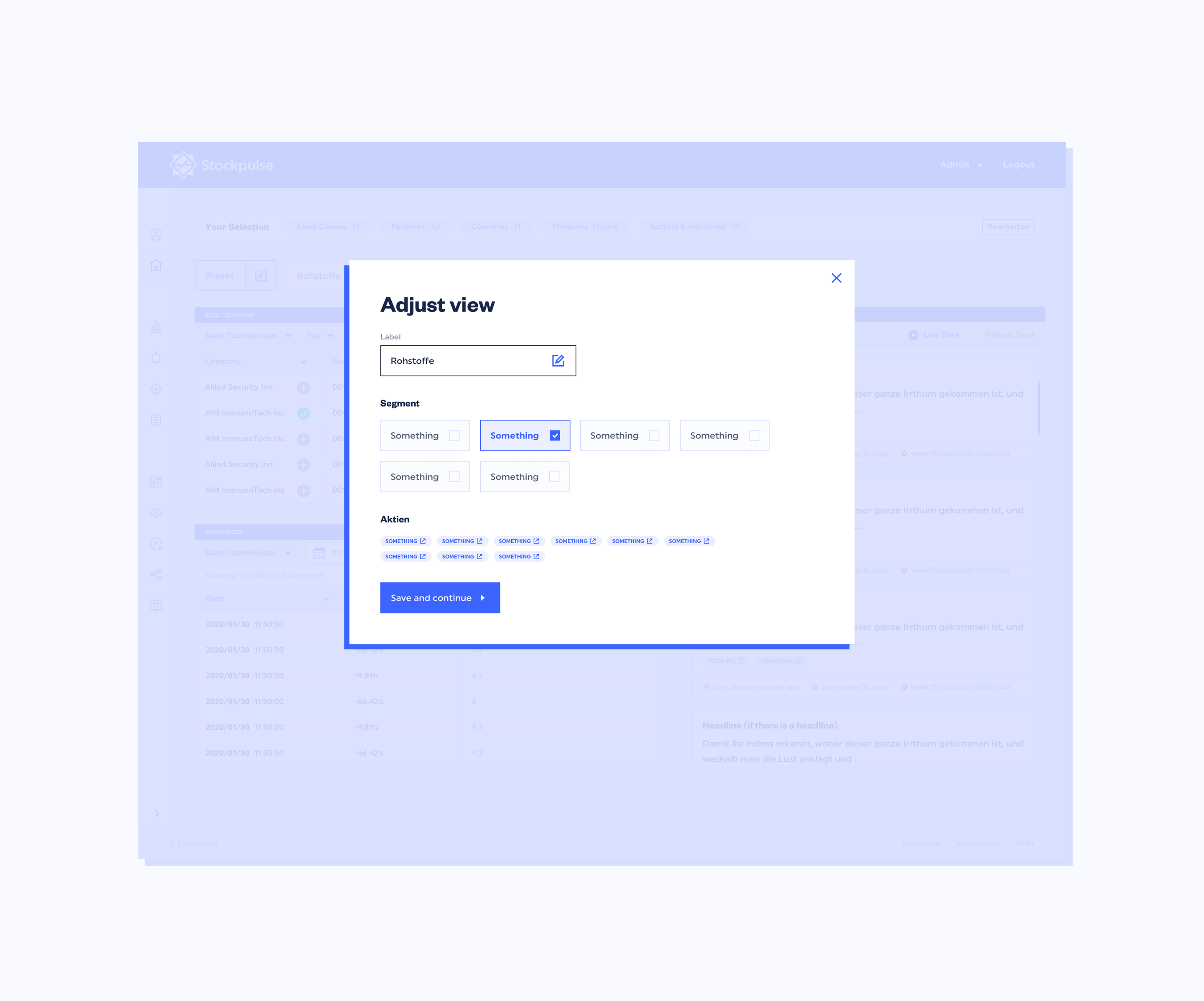
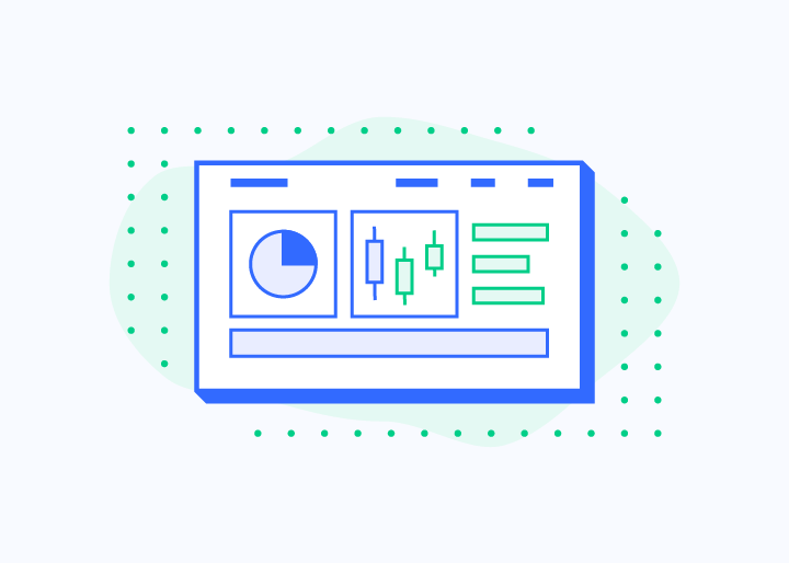
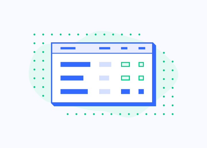
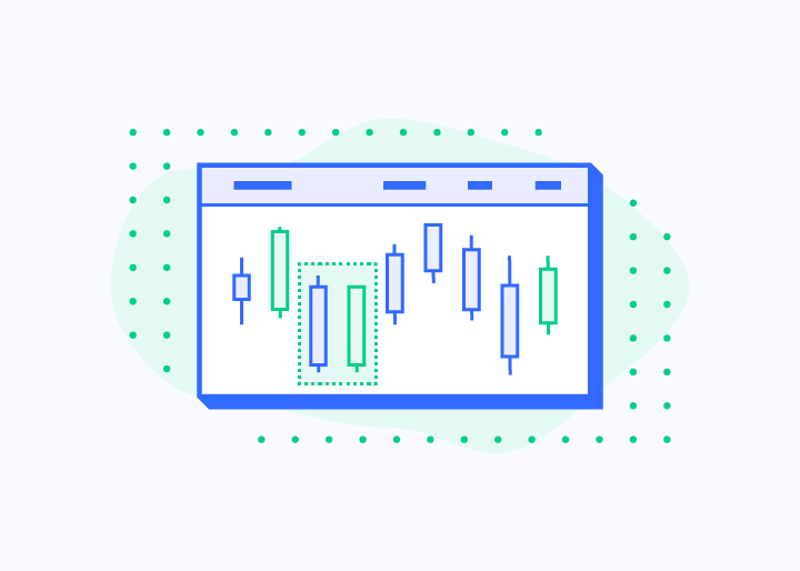
Our project involved three main components: the Data Center, the Dashboard, and a revamped Stockpulse Homepage. We focused on understanding emotional data trading to integrate these elements seamlessly. We aimed for a simple and flexible information architecture for global use, emphasizing user-friendly tools, APIs, and features. Client feedback during wireframing ensured a strong foundation before designing the visual frontend. Our goal was to make Stockpulse’s complex and abstract data easy for users to understand quickly.
Evolving the Logo
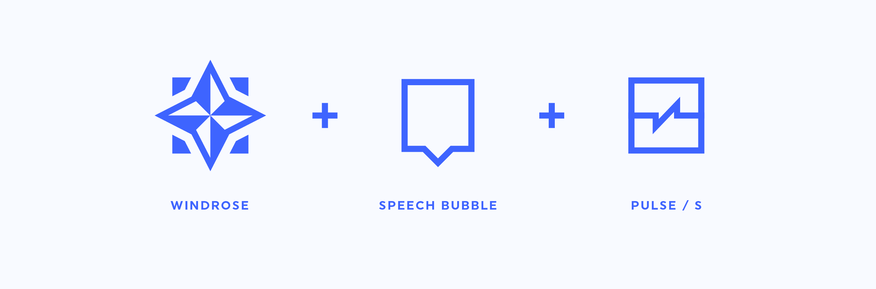
While developing the new Interface Framework, it became clear the Stockpulse Brand needed an update. The logo was redesigned, blending key elements like the windrose and graph with new features. The result is a striking new mark paired with a modern font. Both the icon and wordmark can be used independently, and the icon now works well in very small sizes.
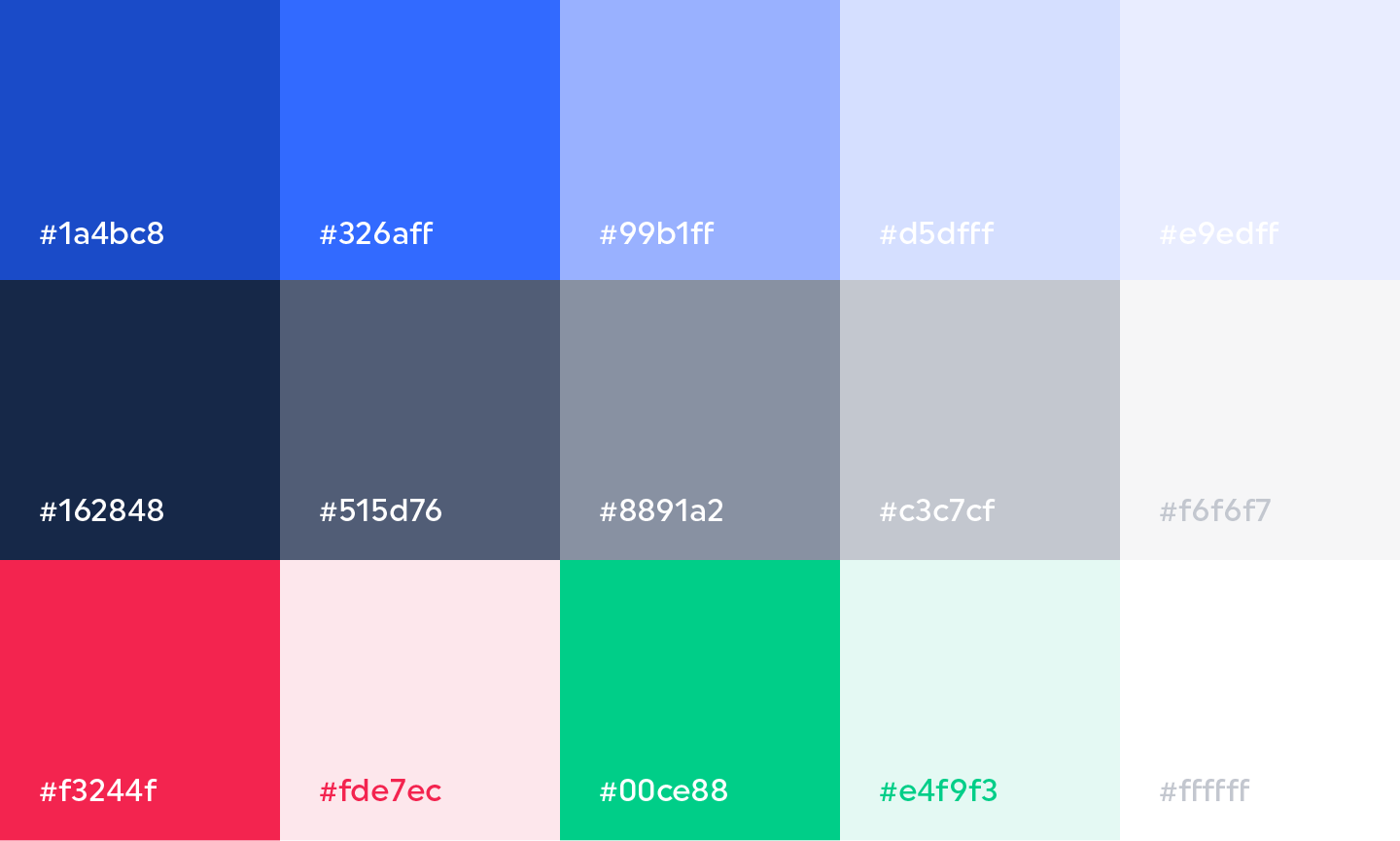
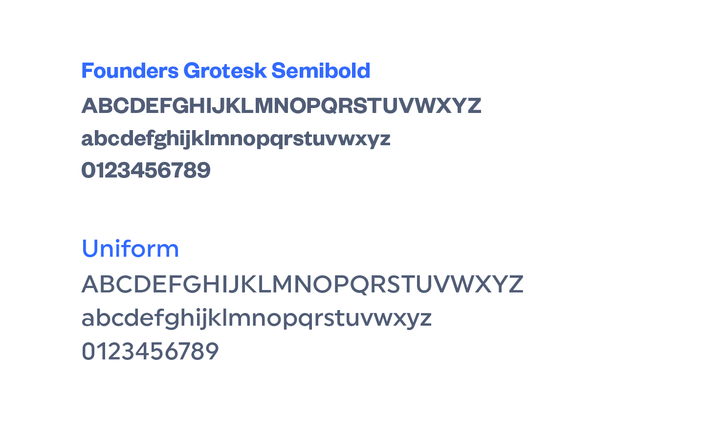
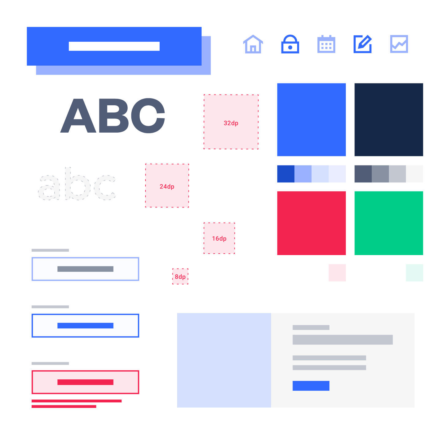
Fonts & Colours
A vibrant new color palette was created alongside the logo. The aquamarine blue is eye-catching and serves as a perfect guide for the user interface. Combined with accent colors and ample white space, the interface is clean and easy to navigate. The new font combination, featuring a bold Grotesk headline and geometric copy, complements the straightforward look and feel of the new design.
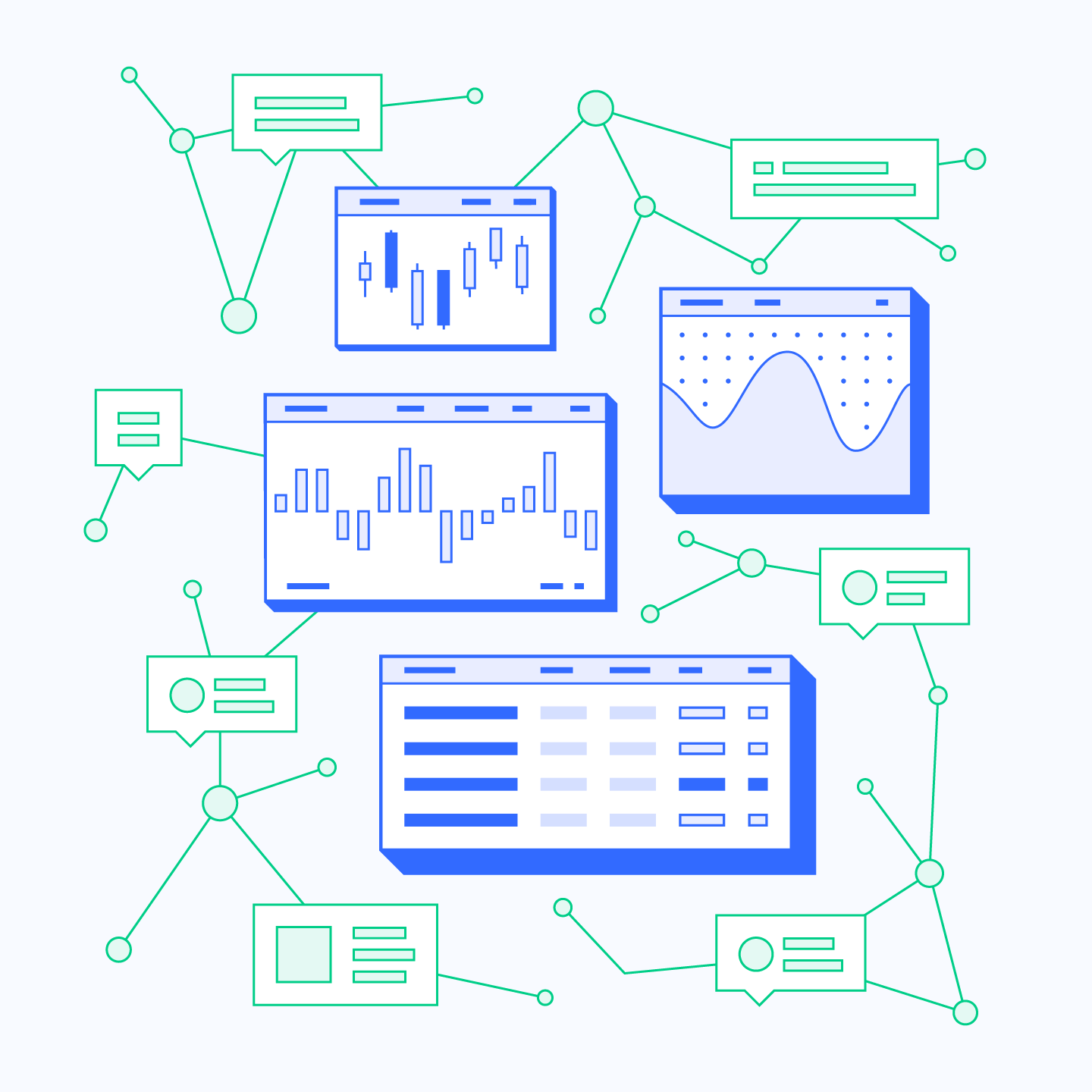
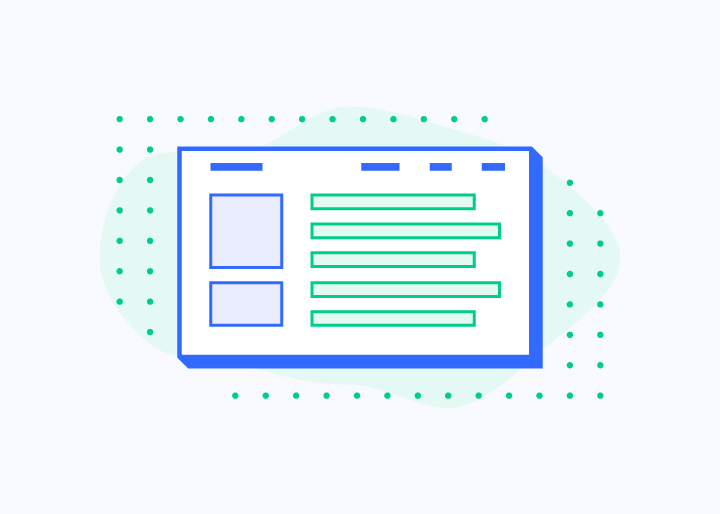
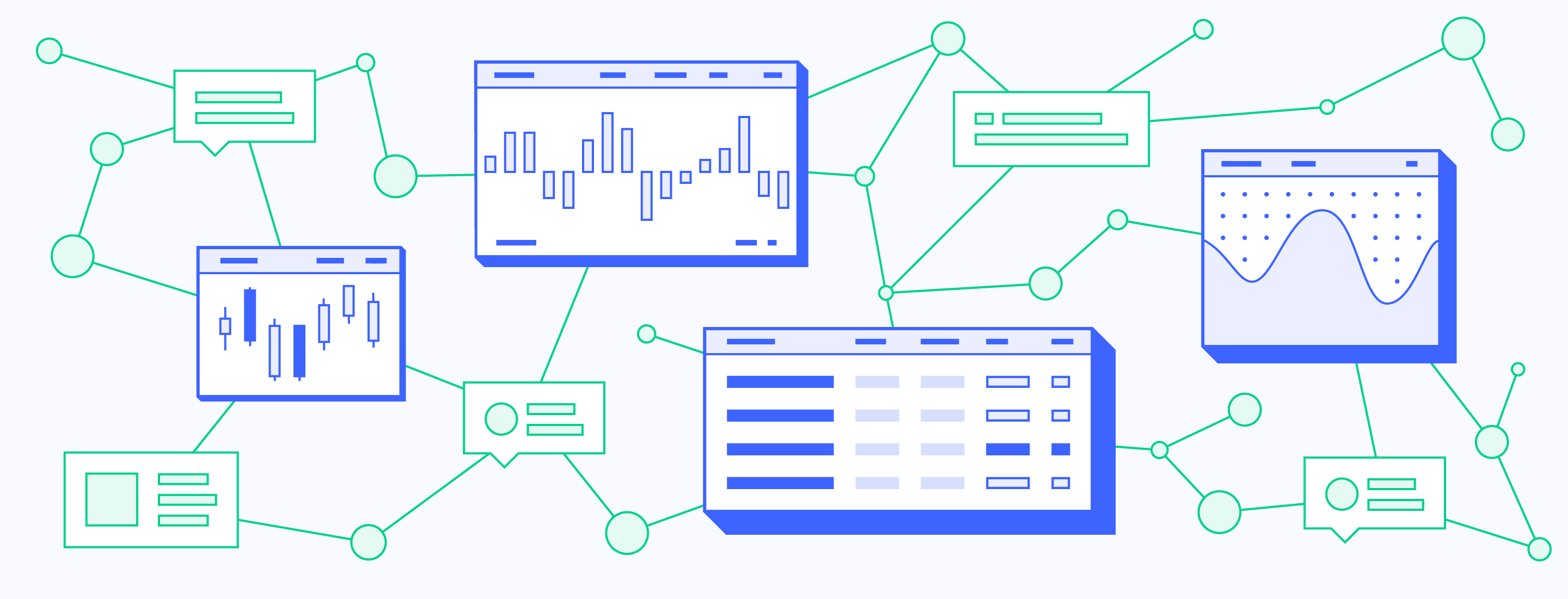
Illustrations
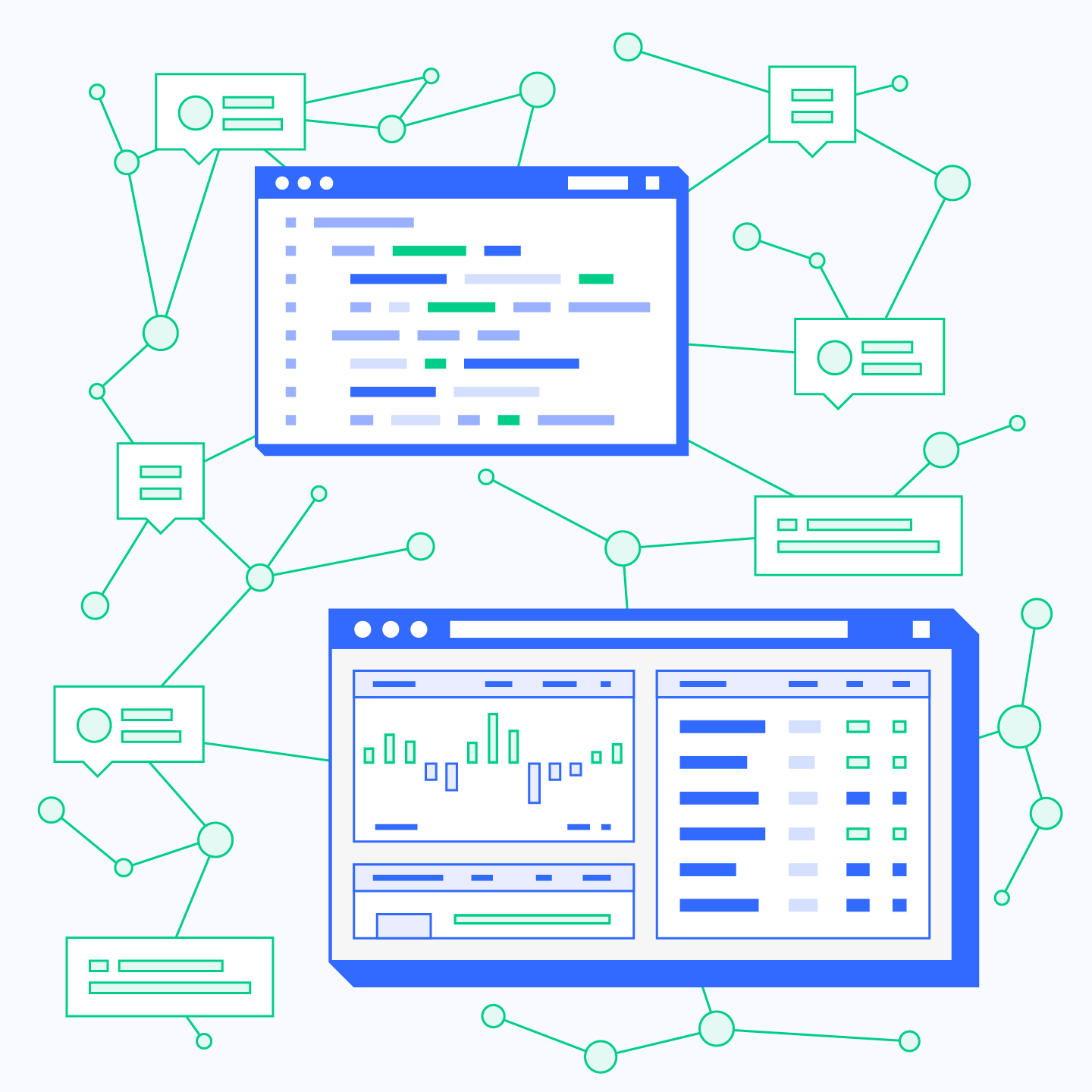
Illustrations were used to provide context and enhance the user experience by visually supporting the copy. The style is purposely flat and clean, using only the two primary brand colors and their shades. The wireframe-like images also reflect Stockpulse's tech background. To ensure high scalability, the isometric elements can be combined and extended indefinitely, as they lack a specific vanishing point.
Building a Framework
Due to the agile nature of the project, a pattern library was built, and mirrored in the frontend framework. Elements like color, font, and button can be adjusted globally, with the component library as the central source of truth. Instead of working screen by screen, a holistic and flexible library of building blocks for various purposes was created. This allows for rapid and global adjustments in both design and front end.
Webdesign
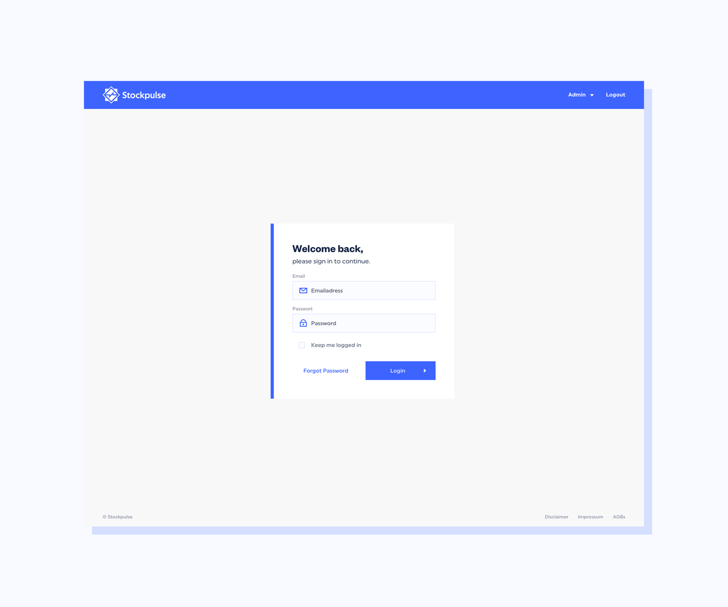
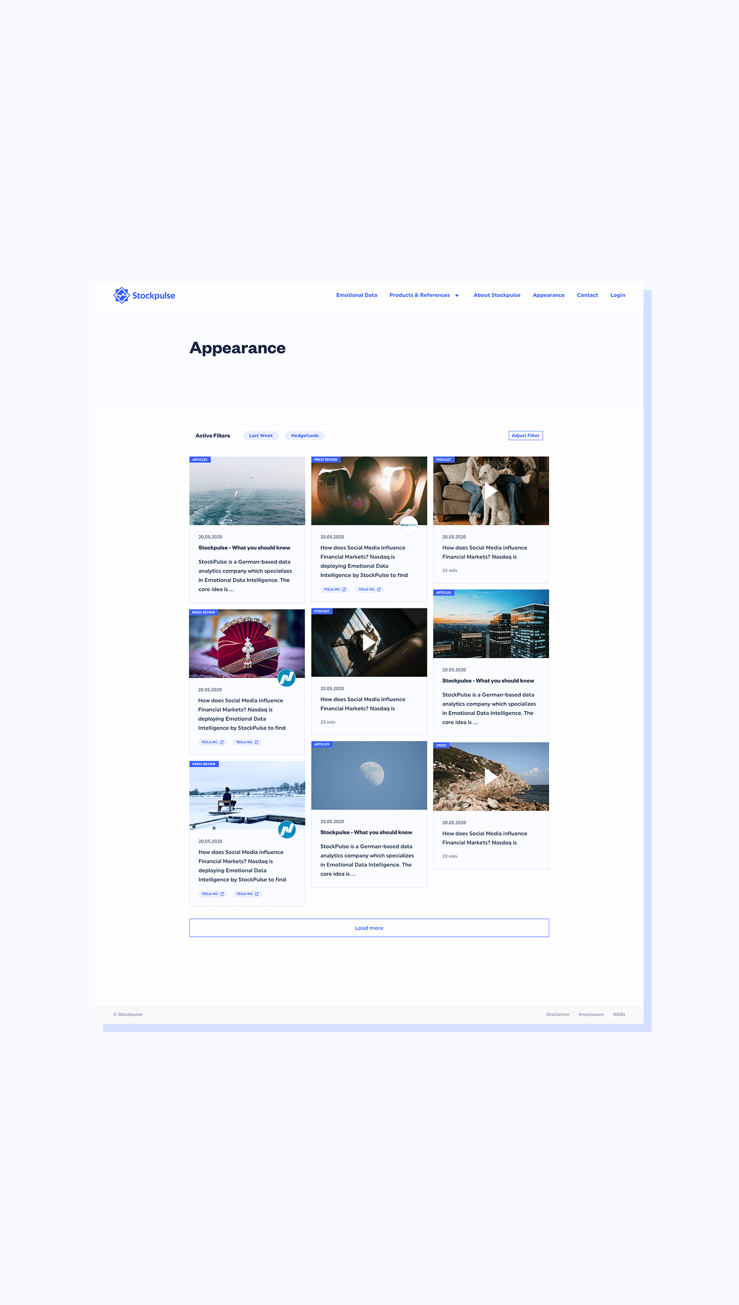
After building a strategy, understanding the client's needs, and creating solid wireframes, the design of the Dashboard, Data Center, and Product Pages began. The Design System ensures a flexible but consistent look and feel across all breakpoints.