Smart EQ Control App
Smart pledged to switch to building only electric cars by 2020. Amid this decision, a new app was needed to control the smart EQ, their new line of electric cars. The goal was to enable customers to have complete remote control over their smart car using the latest APIs and hardware.
CLIENT
smart
ROLE
UI Design | UX Design | Illustration | Branding | DesignOps
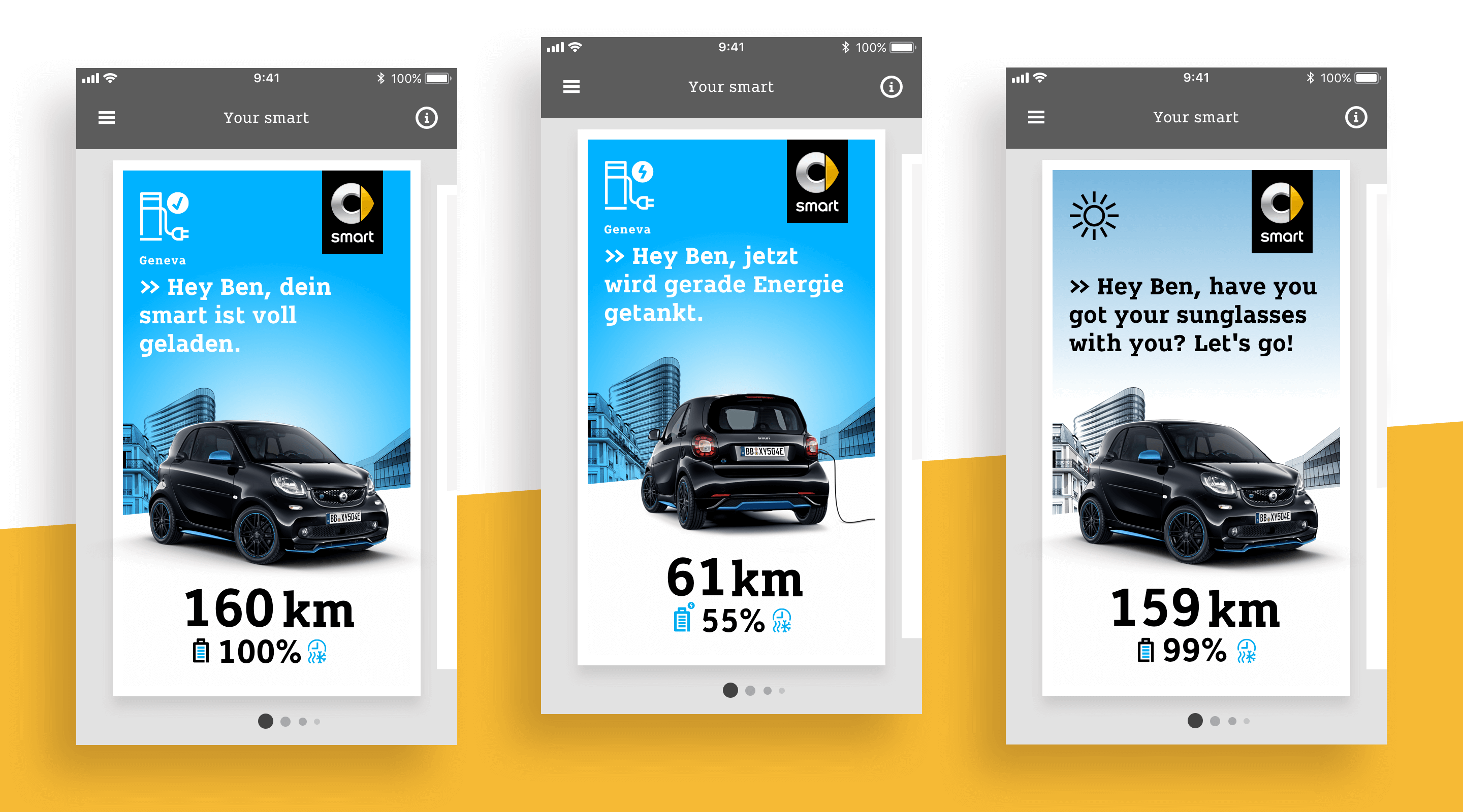
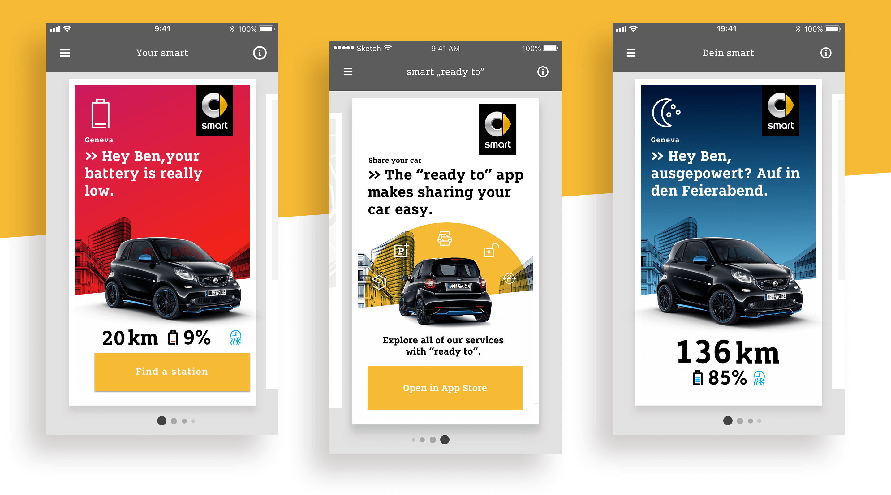
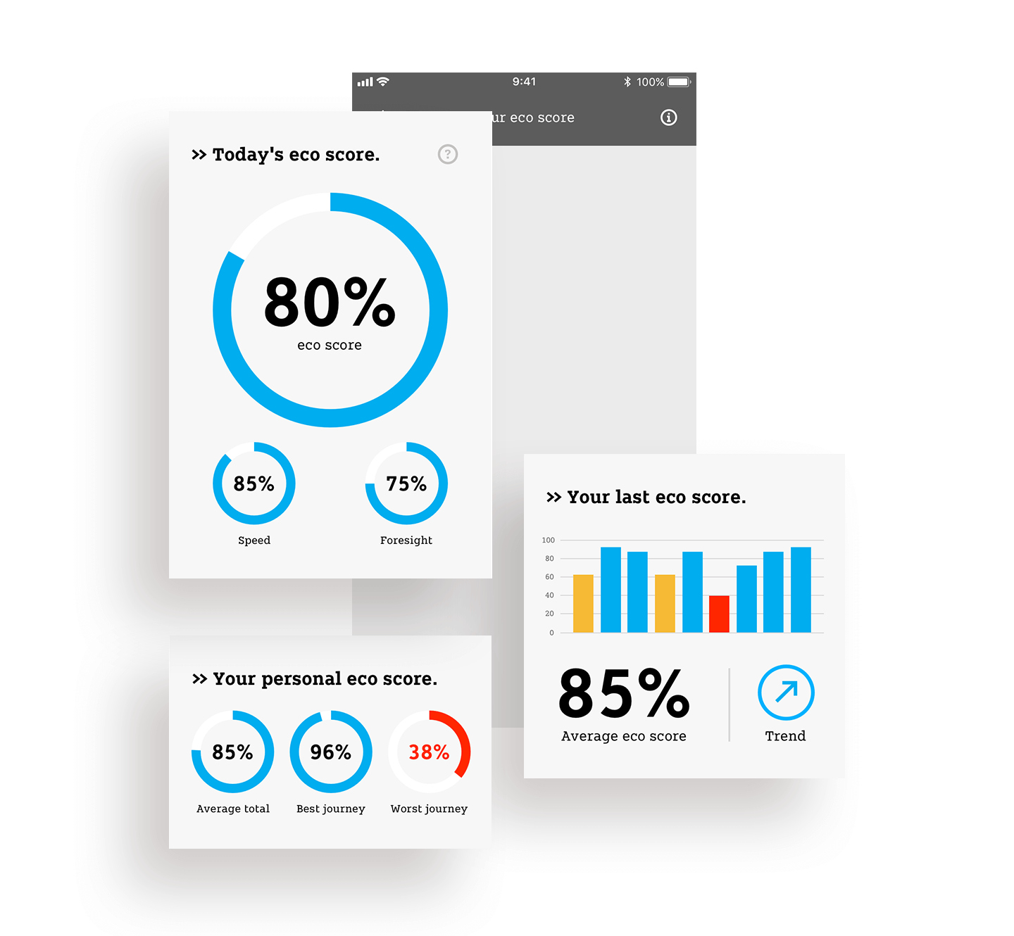
Fun and useful
I was part of the creative team bringing the app to life. The main goal was to provide the best possible user experience while integrating all important brand aspects into the digital space. A Design System was created to form a solid foundation for all designs, and animations and illustrations were explored to engage customers in a fun and exciting experience.
One Design for all Devices
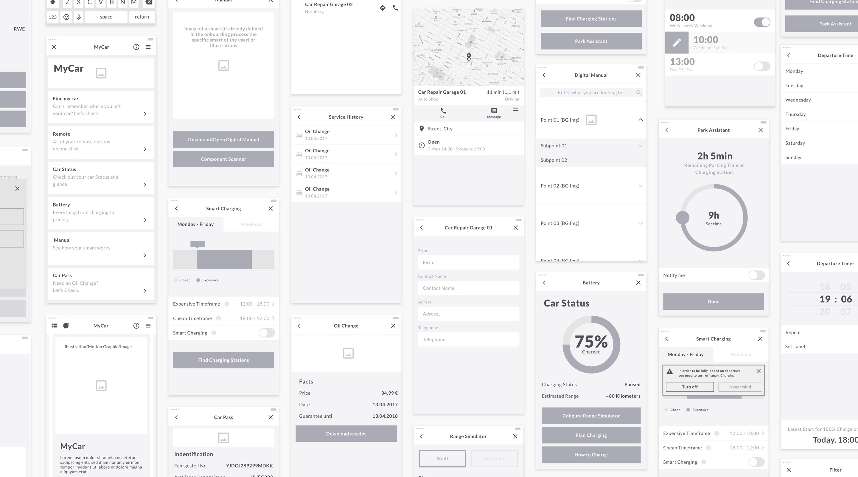
Given the size of the project, the design was made reusable on all mobile devices. By defining set paddings and margins, each element was designed to be fully responsive. This fluid approach ensures that the design principles remain consistent across platforms and devices, saving time in the long run.
A systematic approach
With no initial app design guidelines, iconic brand elements were carefully selected from existing material. The design had to work on all mobile devices and remain consistent across multiple designers. A framework of paddings, margins, colors, fonts, and behaviors was created first. Each element has a unique ID for easier collaboration, and all information is stored centrally to prevent data loss when team members leave.
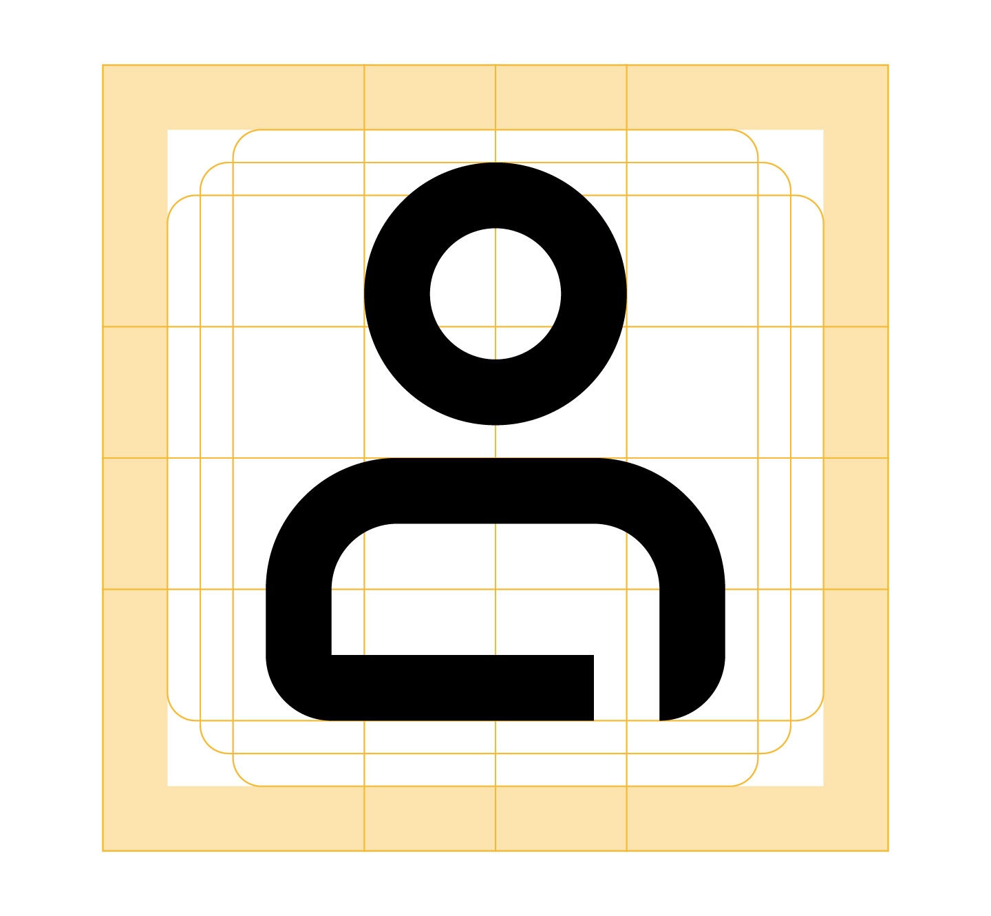
From print to digital
We reviewed all existing brand icons, noting their specific character. Since most were designed for print, we carefully adapted them for the app. Following Google Material Guidelines ensured consistent use across all digital products while maintaining the brand's distinctive features.
Illustrations and Animations
To enhance relatability, illustrations were used for explanatory content. The simple style and color palette ensure clarity and work well on smaller devices. The flat design allows elements to be combined in various ways, creating an expanding library of reusable assets.